
Case Study · Rebrand
Kababji
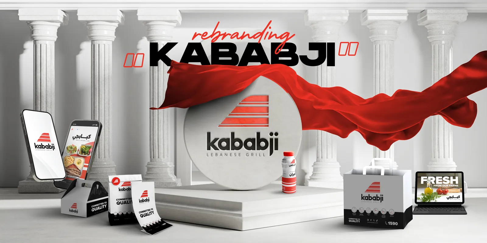
We modernised a much-loved Lebanese grill and carried the new Kababji through every touchpoint, from the master logo to storefronts, packaging, uniforms and the delivery fleet.
The Brief
Keep the Soul. Sharpen the Sign.
Kababji is celebrated for authentic Lebanese cuisine and the standard it keeps on every plate. Its identity needed to look as modern as the service, without losing the recognition built over the years.
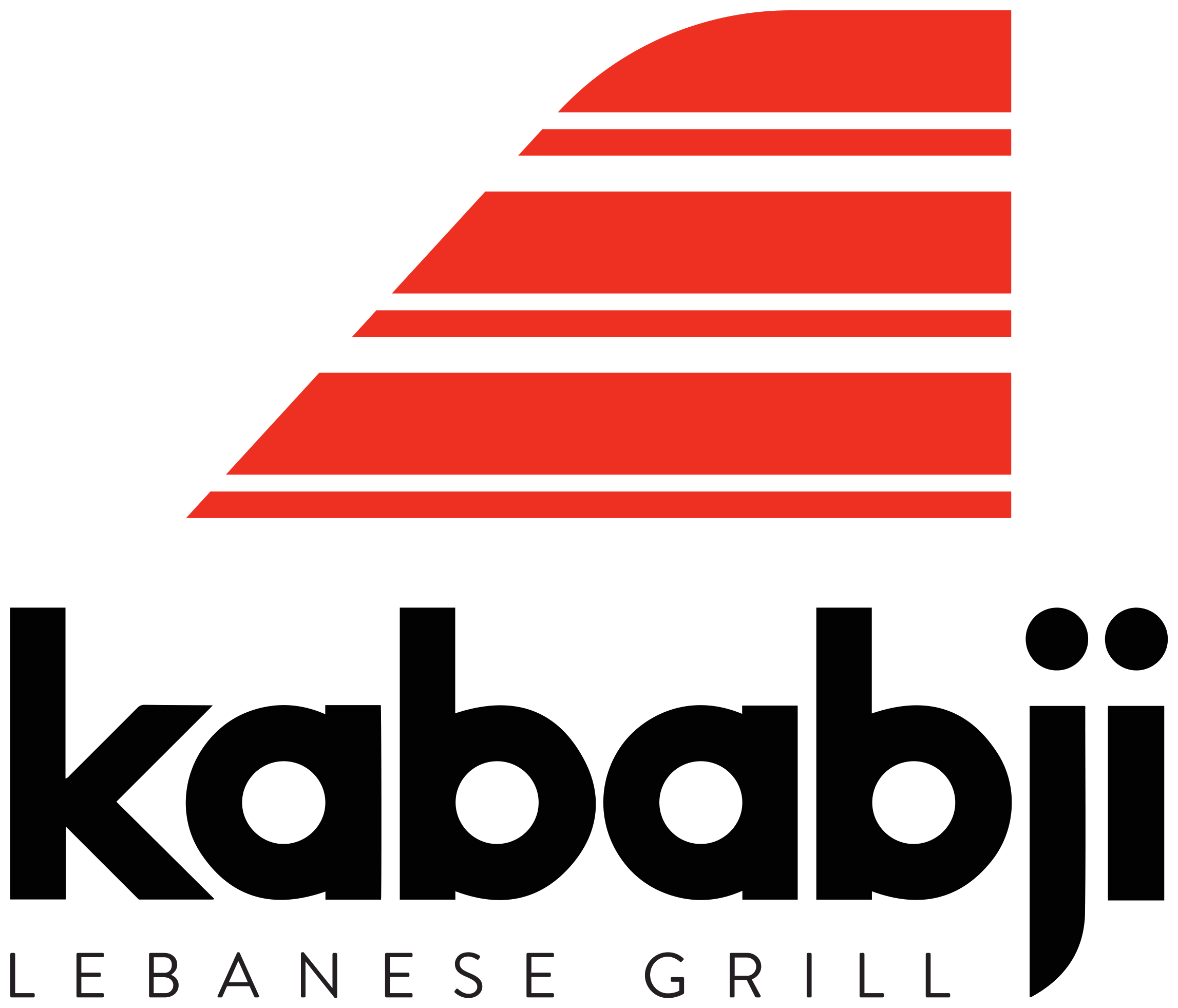
Trends in logo design were moving towards simplicity and clarity. We redesigned the master logo to be more modern and up to date while keeping the essence of the original: sharp edges reduced and a slight curve introduced to the emblem. Then we built a system strong enough to hold together across hundreds of real-world applications.
The Mark
How the Mark Was Sharpened
- From the GrillKababji is a Lebanese grill. The fire is where every plate begins.
- Into the EmblemThe emblem’s stripes carry that energy, with softer edges and a slight curve.
- The Master LogoModern and up to date, while preserving the essence of the original.
The Idea
The Flavour of Lebanon, the Savour of the Mediterranean.
The brand speaks with the character of the restaurant itself.
- Sophisticated
- Modern
- Authentic
- Elegant
The Identity
From the Billboard to the Delivery Bag
A system built for the street, the counter and the road. Click any image to see it full size.
What We Delivered
The Full System
- Master logo redesign
- English and Arabic lockups
- Colour palette for digital and print
- Typography
- Iconography and menu labels
- Photography direction
- Social media templates
- Billboards and offline presence
- Stationery and brand assets
- Packaging system
- Uniforms for every role
- Vehicle livery
- Brand guidelines
Ready to Modernise Without Losing Who You Are?
A line or two is enough. We take it from there.