
Case Study · Identity and App
Boom
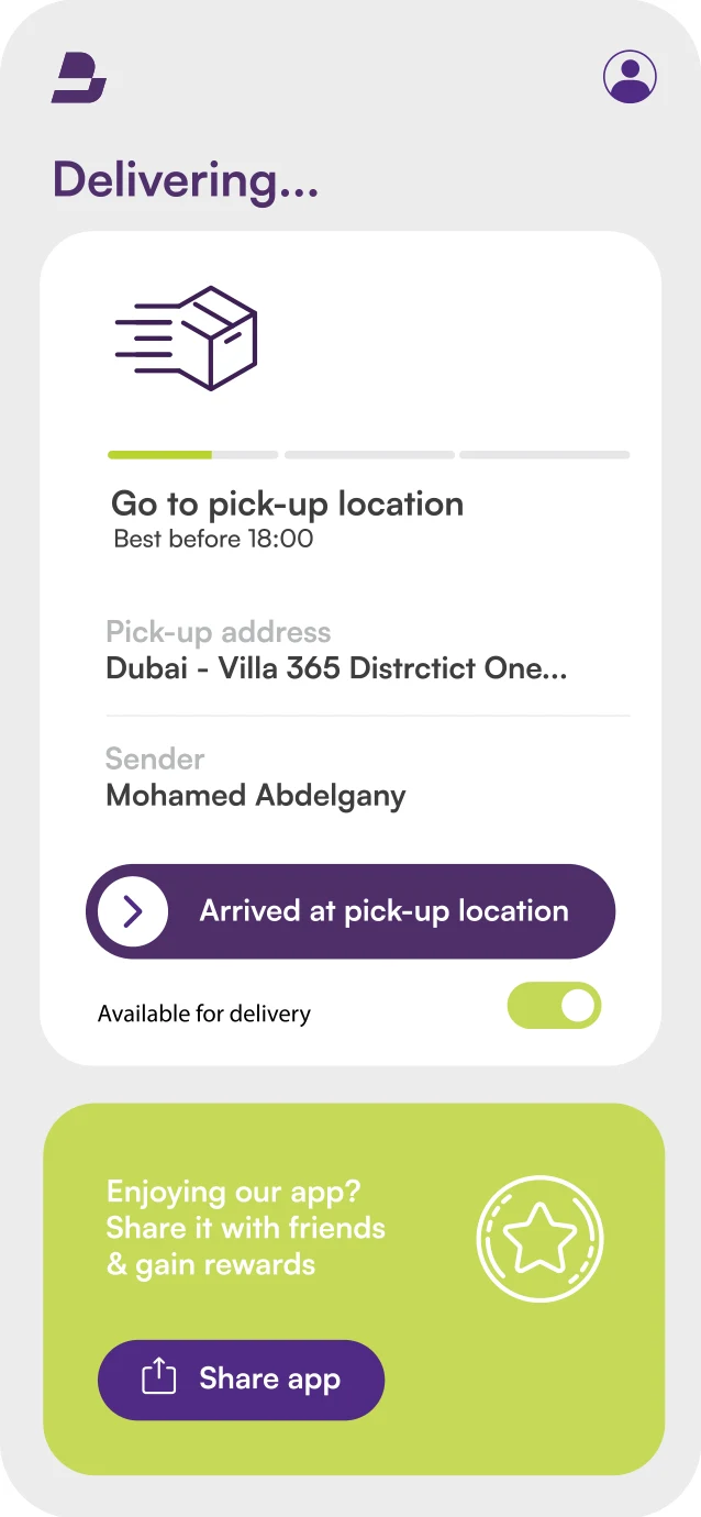
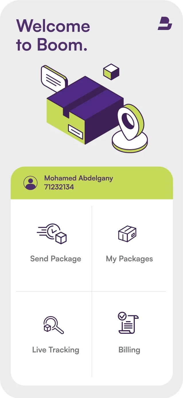
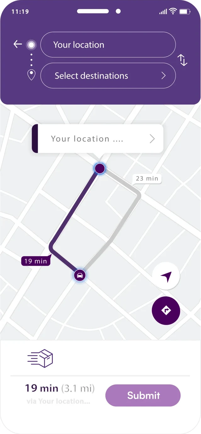
Boom lets anyone send a package from one emirate to another: drivers bid for the job, the app assigns one, and the package is on its way. We gave it an identity and an app look that feel fast, friendly and trustworthy.
The Brand Film
Boom, in 40 Seconds.
The Brief
Make Sending a Package Feel Easy.
Sending something across the emirates should be as simple as booking a ride. Boom needed a brand people trust with their things, and an app that makes a bidding marketplace feel effortless.
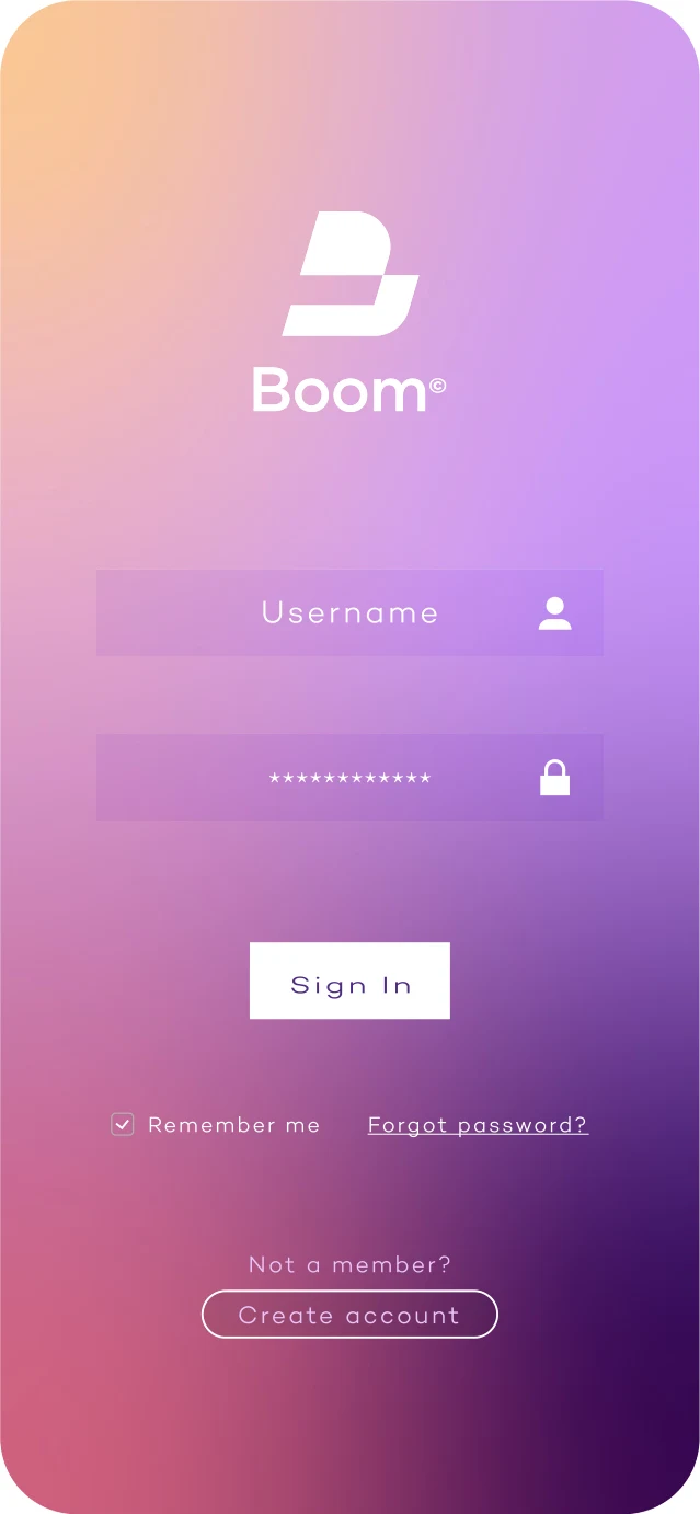
We built the identity from the app outwards: a bold emblem that works as an app icon, a violet palette with a fresh conifer green for actions, a UI colour system for buttons, forms and states, and an isometric illustration style that explains packages, routes and tracking at a glance.
How Boom Works
Dubai to Sharjah in Four Taps
The Idea
Delivering Across the 7 Emirates.
Friendly, quick and clear, in every screen, post and notification.
- Isometric Illustration
- Joyful Photography
- Violet and Conifer
- Clear UI
The Identity
A System Built for Screens
From the app icon to the social grid. Click any image to see it full size.
What We Delivered
The Full System
- Logo and emblem
- Logo variations and safe zone
- English and Arabic typefaces
- Core and extended colour palette
- UI colour system
- Gradients
- Icon set
- Isometric illustration style
- Photography direction
- App icon
- App look and feel
- Social media templates
Launching an App? Let’s Give It a Brand.
A line or two is enough. We take it from there.