
Case Study · Brandbook
TGT
A complete brandbook for TGT, a well-diagnostics technology company: the logo, a sphere-based pattern language for its product lines, workwear and a verbal identity built on “Beyond Barriers”.
The Brief
Make Deep Technology Feel Clear.
TGT looks through the barriers of a well to reveal how it flows and whether it holds. Its brand needed to carry that precision across a global industry.
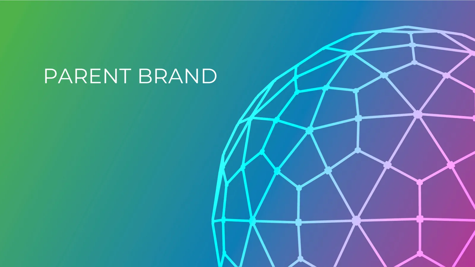
The business rests on two foundations, flow and integrity, so the pattern language does too. True Flow is drawn with circular, linear shapes; True Integrity with geometric, angular ones. The parent brand joins both in one sphere. Around it we built colours, fonts, icons, assets, workwear rules and a full verbal identity.
The System
How the Pattern Was Built
- Inside the WellTGT diagnoses well flow and integrity through the barriers.
- One SphereFlow and integrity meet in a single sphere: the parent pattern.
- Beyond BarriersThe mark that carries it, on every report, site and coverall.
The Idea
Beyond Barriers.
“Beyond Barriers” isn’t just what TGT does; it’s who TGT is.
- Integrity
- Empathy
- Client-Centric Innovation
- Growth Mindset
The Identity
From the Pattern to the Coverall
Click any image to see it full size.
What We Delivered
The Full System
- Logo and variations
- Colours and fonts
- Pattern principle
- Product line patterns
- Background combinations
- Iconography
- Imagery direction
- Stationery and brand assets
- Workwear and PPE rules
- Brand vision and mission
- Values, voice and tone
- Messaging pillars and key messages
Got Complex Technology? Let’s Make It Clear.
A line or two is enough. We take it from there.