
Case Study · Identity
Roots Land
A bilingual identity for Roots Land, a Dubai real estate company founded in 2007, built to feel established, warm and at home in both Arabic and English.
The Brief
An Established Name Needs a Mark to Match.
Roots Land offers 360° real estate services under one roof: buying, selling, renting, valuations, research and property management.
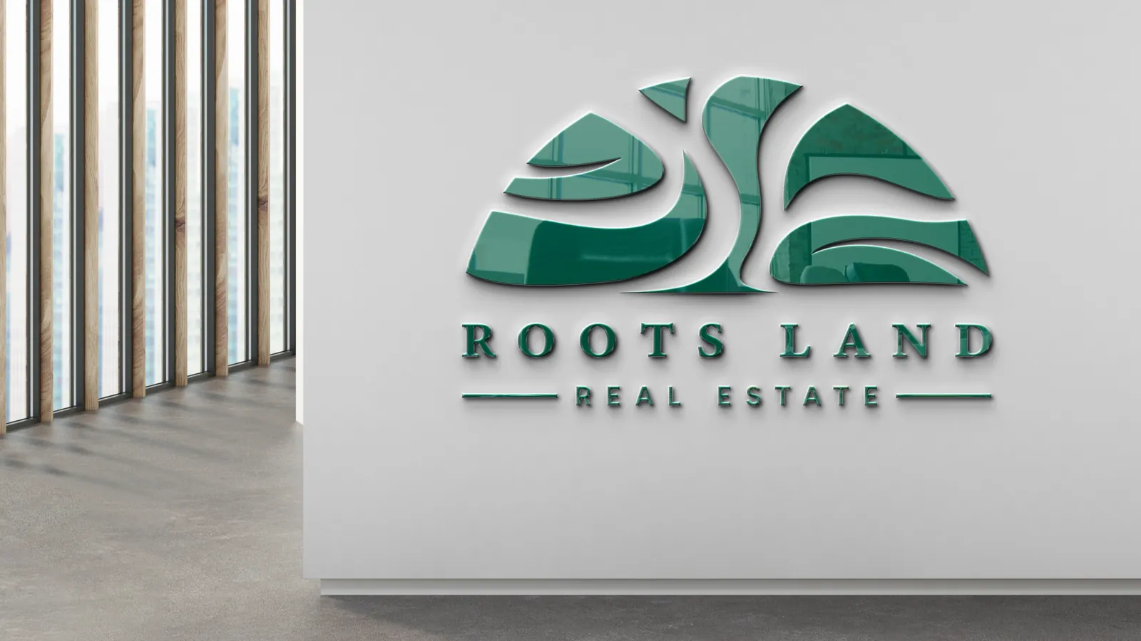
The brand had to speak to investors, owners and tenants across nationalities, so the mark had to work as well in Arabic as in English. We built a symbol from flowing, land-like forms, paired it with Latin and Arabic wordmarks, and set a deep green and warm cream palette that feels grounded and premium.
The Mark
How the Mark Took Root
- RootsA company that has grown in Dubai since 2007.
- LandFlowing forms, like land and dunes, shape the symbol.
- One Mark, Two LanguagesThe symbol with its Latin and Arabic wordmarks.
The Idea
Your 360° Real Estate Partner in Dubai.
Grounded, warm and clear, in English and Arabic.
- Established
- Warm
- Bilingual
- Grounded
The Identity
From the Wall Sign to the Feed
Click any image to see it full size.
What We Delivered
The Full System
- Symbol and Latin wordmark
- Arabic wordmark
- Logo spacing and variations
- Colour palette and combinations
- Arabic and Latin typography
- Business cards and stationery
- Signage
- Merchandise
- Email signature
- Social media direction
- Hashtag guidelines
- Brand guidelines
Building a Brand in Real Estate?
A line or two is enough. We take it from there.